An (unscientific) approach for determining the ‘typical’ frequency of significant cross-country correlations using World Bank data and R.
What attracted me to the field of economics when introduced to it in high-school was the apparent abundance of solutions it offered for everyday problems.
Does your country have low life expectancy? No problems: research has found that countries that invest more in public health perform better on this measure.
Low GDP per-capita? Just improve your governance; as better governed countries tend to be richer.
Suffering from internal conflict? Rough-terrain is statistically linked to conflict, perhaps you could invest in earth-moving equipment?
While I’m clearly being facetious; at the time it often did seem like the answer to any question we cared about was just one cross-country correlation away. Take the plot below from the UNDP’s 2010 Human Development Report:
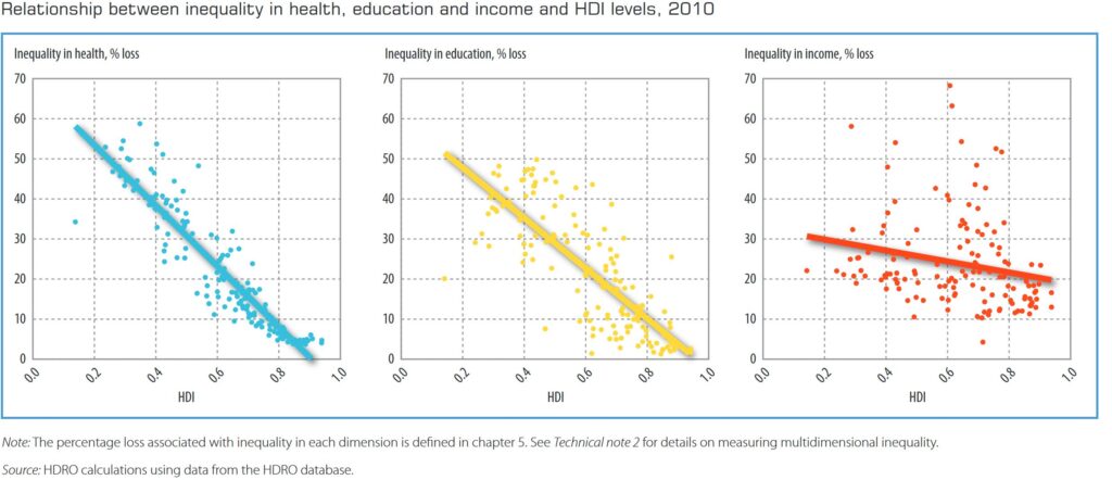
For the casual reader it seems clear that more human development goes hand-in-hand with lower inequality. And while the full report does include a more nuanced discussion of the idea, it doesn’t necessarily discourage this interpretation, noting:
“…There is a strong negative relationship between inequality and human development. Inequality in health, education and income is negatively related to the HDI, with the relationship much stronger for education and income (figure 3.3). This result suggests that reducing inequality can significantly improve human development…“
Source: UNDP (2010), Human Development Report 2010, p.58 see link.
Although this is a plausible enough interpretation of the data, research on global issues seem to frequently present these types of relationships. It’s almost as if every solution to a problem has a cross-country correlation to support it.
Is Everything Correlated?
Although trained statisticians know employing correlations in this way isn’t a good idea, it doesn’t stop scatter plots being frequently ‘weaponized‘ in this way — particular as statistical ammunition has become so easy to acquire. Whether the report is the work of a think tank, international organization or data journalist; a strategically placed scatter plot can make the cause of a problem look simple and easier to solve, than it actually is. After all:
“if you torture the data long enough, it will confess to anything”.
Ronald H. Coase
This is why when working on cross-country problems I’ve adopted the working assumption that everything is probably correlated. It’s also why I decided to devise this (unscientific) test — to see just how common cross-country correlations are, and how warranted my skepticism actually is.
With the steps of the test including:
- Randomly selecting a series of cross-country measures
- Calculating pairwise correlation coefficients for each pair
- Dropping pairwise correlations where a small number of observations were available
- Calculating the % of statistically significant correlations
Step 1: Load libraries and create list of indicators
To get a nicely formatted set of cross-country data I’ve used the ‘wbstats‘ package. This makes it simple to download a variety of socioeconomic data from the World Bank (using the ‘indicator id’). In addition, as each indicator is categorized and labelled, I’m able to evenly sample across the topics; which hopefully reduces the chance that I’m comparing variables measuring the similar concepts (such as GDP per-capita vs. average income).
Of course, this also means that the variables available aren’t themselves random. But, as I’m often presented with data (or relationships) from similar sources this would seem a reasonable source to draw from.
R Code:
library(tidyverse)
library(wbstats)
library(Hmisc)
library(corrplot)

#get list of available indicators from wbstats
lkp_wb_data_list<-wb_cache()

#create list of indicators
lkp_wb_indic<-lkp_wb_data_list$indicators

#unnest topic variables
lkp_wb_indic<-lkp_wb_indic |>
  unnest(topics)  |>
  rename(category=value)
Step 2: Select a ‘Random’ Set of Cross-Country Indicators
Now that we have a list of indicators to choose from in ‘lkp_wb_indic’ we can select a random sample (from our non-random source). As noted, I’ve sampled across topics – which is why I’ve first grouped the available indicators by the ‘topic’ variable before using the ‘slice_sample’ function.
I’ve excluded the DSSI database as many of its indicators didn’t appear to be available (resulting in the wbdata() function failing). For the sake of convenience over science, I’ve also only sampled from indicators with topic labels.
-1 points from science, but +1 to expediency.
R Code:
#define the seed
set.seed(1)

#select one variable per category
lkp_wb_indic_rand<-lkp_wb_indic |>
  filter(!is.na(category),
         source != "International Debt Statistics: DSSI") |>
  group_by(category) |>
  slice_sample(n=1) |>
  distinct(indicator_id)
#download the sampled indicators
dta_rand_data<-wb_data(indicator=lkp_wb_indic_rand$indicator_id,return_wide = FALSE)
#select necessary variables and drop missing values
dta_rand_data<- dta_rand_data |>
select(iso3c,country,date,indicator_id,value) |>
filter(!is.na(value))
#create summary to identify year with highest coverage
sum_rand_data<-dta_rand_data |>
group_by(indicator_id,date) |>
summarise(n_isos=n_distinct(iso3c)) |>
pivot_wider(names_from = indicator_id,values_from = n_isos)
#filter and widen dataset to make suitable for correlations
dta_rand_data_filtered<-dta_rand_data |>
filter(date == 2018) |>
distinct() |>
pivot_wider(names_from= indicator_id)Step 3: Calculate Pairwise Correlations
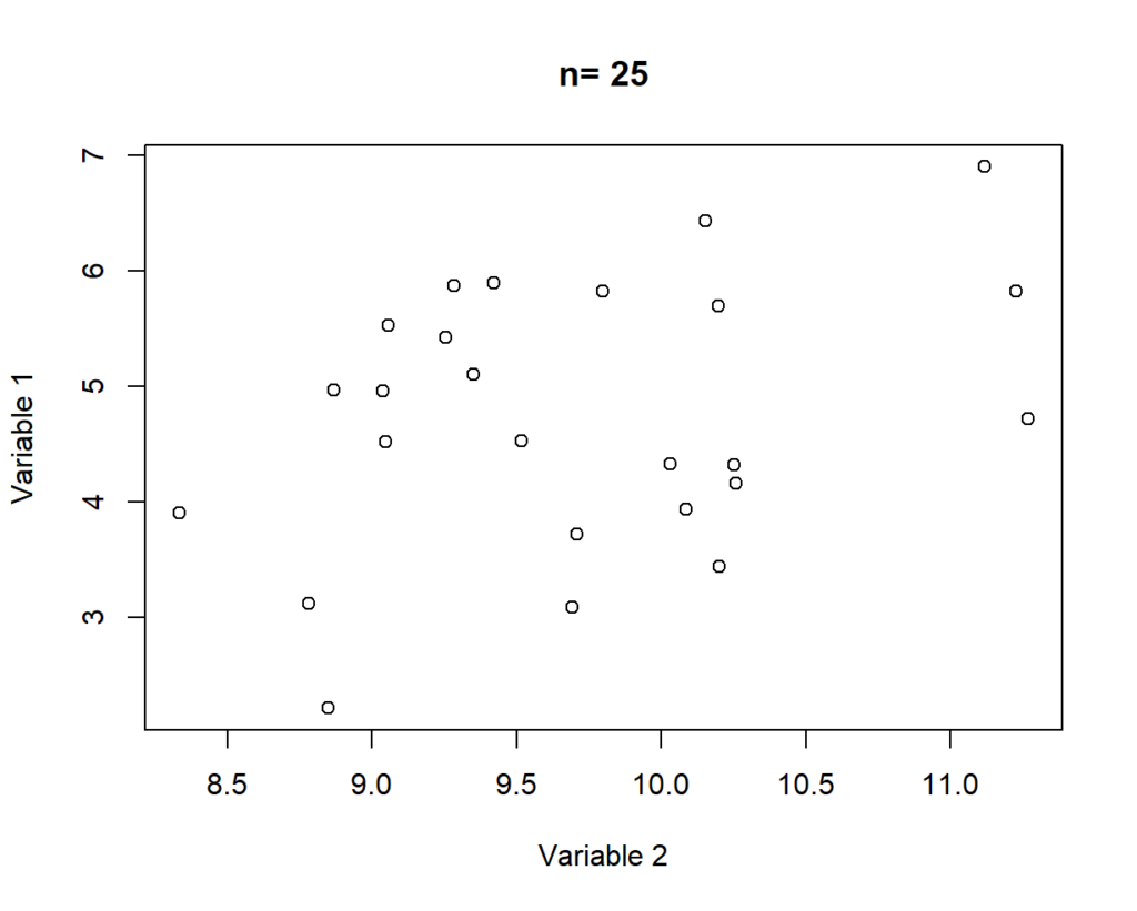
Once the data has been downloaded, we can then calculate pairwise correlations for variables with a reasonable number of observations. In this case I’ve dropped correlations calculated with less than 100 observations. I’ve used this cutoff as the relationship between moderately correlated variables looks more convincing at this point (see below). 2018 was chosen as the focus year as data was available for a wider number of countries for the selected variables.
Again -2 points from science for both of these assumptions, but I’m not trying to win the Nobel Prize. I’ll attempt that in an upcoming post.
R Code:
#calculate correlations
rlt_corr<-rcorr(as.matrix(dta_rand_data_filtered[,-c(1:4)]))

#create separate data frames for p-values, r squared and n
rlt_corr_p<-rlt_corr$P |>
  as.data.frame() |>
  mutate(indicator_id_1= row.names(rlt_corr$n)) |>
  pivot_longer(cols= -indicator_id_1,names_to = 'indicator_id_2',values_to = "p_value")

rlt_corr_r<-rlt_corr$r|>
  as.data.frame() |>
  mutate(indicator_id_1= row.names(rlt_corr$n)) |>
  pivot_longer(cols= -indicator_id_1,names_to = 'indicator_id_2',values_to = "r")

rlt_corr_n<-rlt_corr$n |>
  as.data.frame() |>
  mutate(indicator_id_1= row.names(rlt_corr$n)) |>
  pivot_longer(cols= -indicator_id_1,names_to = 'indicator_id_2',values_to = "n_obs")

#only retain pairwise correlations with more than 100 observations
rlt_corr_filtered<-rlt_corr_n |>
  filter(n_obs> 100) |>
  arrange(indicator_id_1,indicator_id_2)

#merge R squared and p values
rlt_filtered_corr<-left_join(rlt_corr_filtered,rlt_corr_p) |>
  left_join(rlt_corr_r) |>
  filter(!is.na(p_value))

#create a list of unique correlations pairs so duplicates can be dropped
#source: https://stackoverflow.com/questions/28756810/how-to-remove-duplicate-pair-wise-columns
tmp_unique_pairs<-df <- data.frame(t(apply(rlt_corr_filtered, 1, sort))) |>
                         unique() |>
  select(X2,X3) |>
  rename("indicator_id_1" = X2,
         "indicator_id_2" = X3)

#join the unique pairwise combinations with the correlations (to drop duplicates)
rlt_corr_filtered<-left_join(tmp_unique_pairs ,rlt_corr_filtered)
Step 4: Selecting a Cutoff for ‘Significant’ Correlations
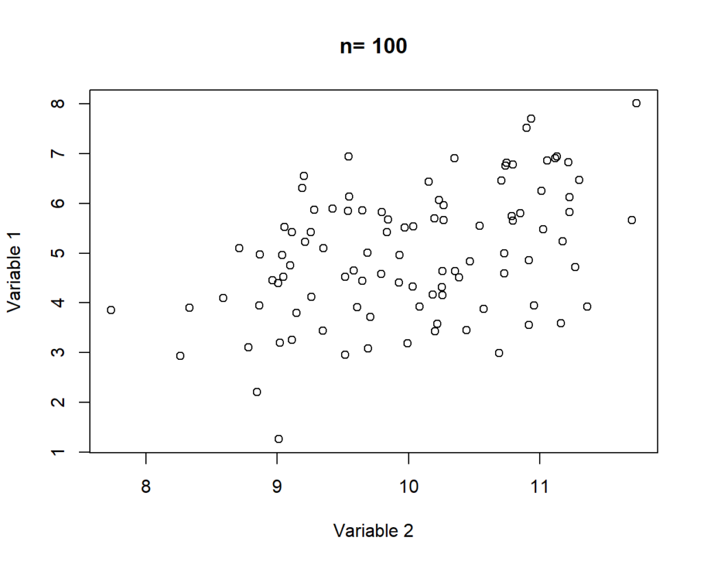
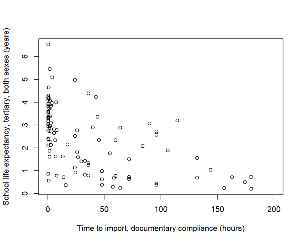
We now have correlation coefficients calculated for each of the pairwise combinations. For the cutoff point I’ve selected an absolute r value (the correlation coefficient) of 0.5. This was chosen as this is approximately the point that correlations start to look convincing (such as the example below).
Results: Is Everything Correlated?
The final step then is to compare the number of ‘significant’ relationships observed as a proportion of our original data set: out of 210 unique pairings nine (4%) were found to be significantly correlated.
R Code:
#join the filtered list with unique combinations to drop duplicates
rlt_corr_filtered<-left_join(tmp_unique_pairs ,rlt_filtered_corr)

#calculate the number of statistically significant r values
table(abs(rlt_corr_filtered$r) >=0.5)

#calculate the denominator- via n choose k (21 choose 2)
factorial(21)/(factorial(21-2)*factorial(2))
So, it appears the skepticism I’ve accrued isn’t necessarily backed by evidence. Meaning that assuming that everything is likely to be correlated in cross-country analysis is probably unwarranted: provided of course, that the data and/or evidence hasn’t been cherry-picked by nefarious statisticians.
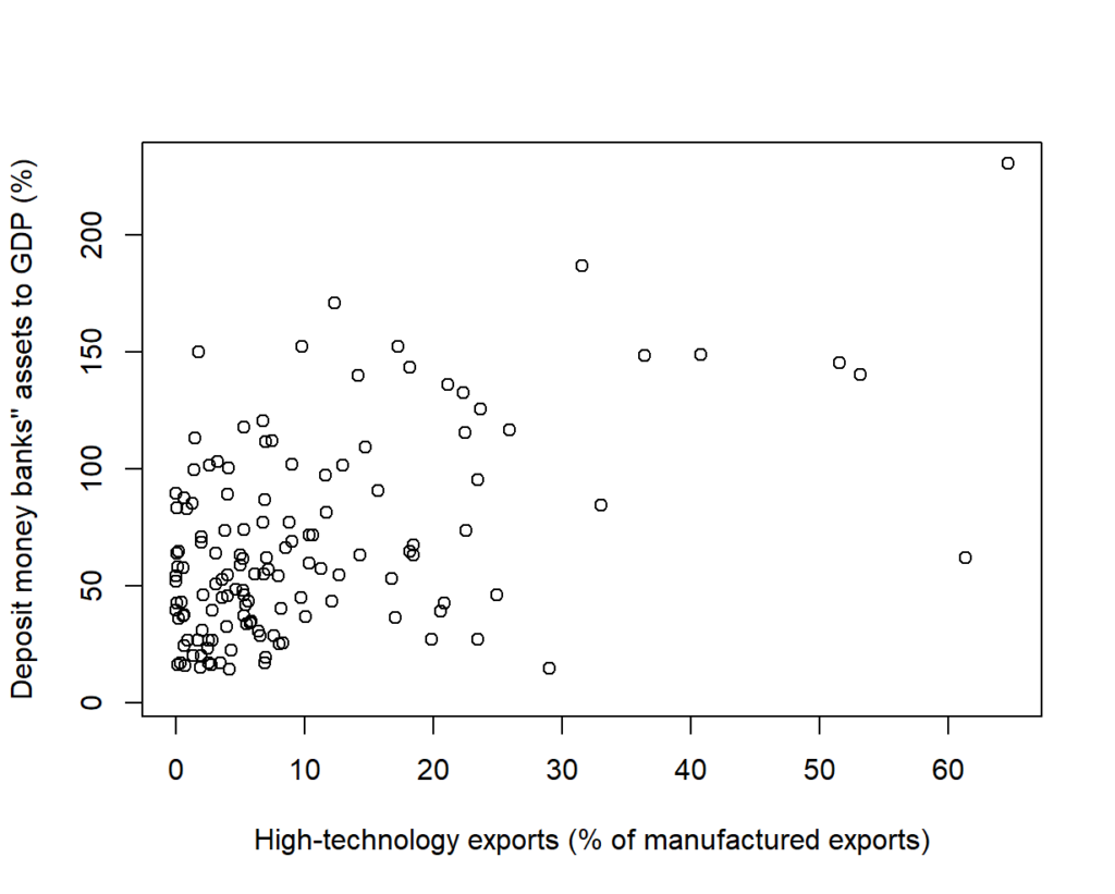
Yet, it’s also important to note that from a relatively small data set we have nine stories to choose from, including there being a link between: import compliance and schooling; the size of the financial system and ICT imports; and urban population growth and the proportion of the population made up of elderly men.
All of which, are likely be endogenously determined relationships strongly driven by a variable not included in our analysis. A fact that wouldn’t stop a think tank and/or lobby group from using the relationship to justify their policy intervention of choice. But just like believing everything is correlated in the world of cross-country data, I don’t have any evidence to support that. 😉
Postscript:
I’ve been interested in testing this out for a while so will continue to update this over time: particularly to hide errors and clean up my code (as my implementation is far from rigorous or elegant).
But, noting I’m not the first person to write about this topic and this was far from a rigorous treatment I’ve included a number of additional resources below:
- A frequently cited HBR article on spurious correlations
- Some common pitfalls of the correlation coefficient
- A reddit discussion of some of the problems with cross-country correlations
- Spurious correlations and cointegration (1)
- Spurious correlations and cointegration (2)
It’s also worth noting that while statistically significant associations weren’t as common as I’d assumed; national indicators (and correlations based on them) are harder to interpret than micro-data. Which in addition to publication bias (or glossy report bias) is another reason to approach cross-country studies with skepticism: particularly when they rely too heavily on pairwise correlations for evidence.
Leave a Reply